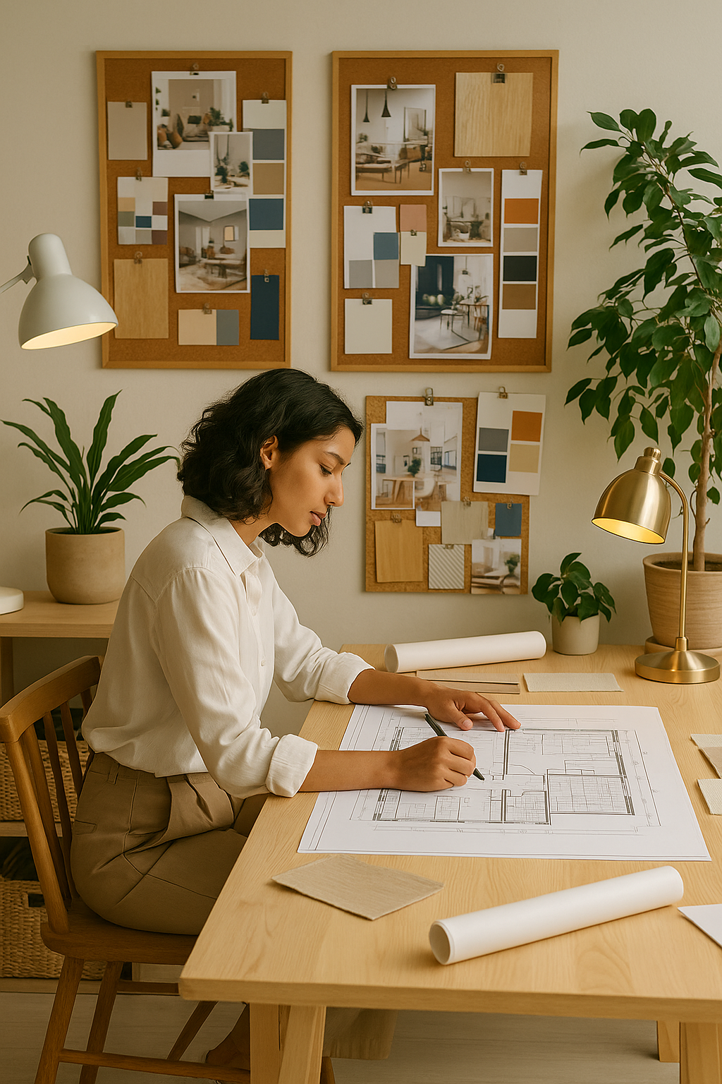
We recently had a very interesting chat online about colour and its effects on our mood and the room that we are in. Here are some notes that I have used over the years and would still refer to on occasion when contemplating what the best use of colour in a specific setting would be.
Monochromatic Colour Scheme

- This colour scheme is based on one colour only - you can use different variations of this colour i.e. light and dark tonal values.
- Be careful it doesn't become too boring.
- Use texture and form to create interest.
- Used in contemporary, minimalist designs.
- You can use neutral colours such as beiges, creams and browns and/or black and white.
Harmonious ( Analogous) Colour Scheme

- Based on two colours next to each other on the colour wheel.
- Usually a calming and soothing scheme because there is not a lot of variation between the two colours used
Triadic Colour Scheme

- Created by using three colours on the colour wheel equal distance from each other.
- Fun and lively.
- Whites and creams used as backgrounds and to soften effects of scheme.
- Can become stressful and irritating if overdone.
- Suitable for playschools, children's rooms etc.
Complimentary Colour Scheme

- These schemes are used by combing two colours opposite each other on the colour wheel.
- They are opposite in temperature i.e. one warm and one cool.
- They can bring balance to each other.
Basic Colour Psychology
Red
- Most powerful colour in the spectrum.
- Can attract and repel.
- Very symbolic - leaders traditionally wore red, red carpet etc.
- Symbolic of power.
- Colour of fire / passion (brothels etc).
- Has been shown to increase heart rate and blood pressure.
- Very vibrant.
- Can be used in building where you want to increase physical activity.
- Can stimulate appetite.
- Not used in doctors/dentists surgeries/butchers etc as the colour of blood.
- Makes a room seem warm.
- Should be avoided in hyperactive children and violent adults.
- Not a good choice for bedrooms as this is a place of relaxation.
Orange
- Warm, vibrant and energetic colour.
- Thought to raise tolerance and strengthen will.
- Cheerful colour.
- Can be used around children or any place that needs cheering up.
- Thought to increase creativity and appetite.
- Not suitable to use in places of relaxation.
- Shouldn't be used for areas where people that suffer from addictions congregate.
- Can invoke irritability and hyperactivity in children.
Yellow
- Cheerful, warm and welcoming colour.
- Children's playrooms & areas that creativity is required.
- Kitchens.
- Hallways.
- Sales areas and offices as it is a positive colour.
- Used for high visibility areas.
- Can seem sickly when mixed with green.
- People can lose their tempers in yellow rooms so avoid in customer complaints, airport waiting rooms etc.
Blue
- The colour of calm and reason.
- It is the colour of contemplation and reflection.
- It is a good colour to use in areas where you want people to calm down physically or mentally.
- It is a good colour for areas of studying and thought.
- Can lead to feelings of isolation and depression.
- Not a good colour for playrooms
- Sick rooms, recovery rooms, dentists waiting rooms
- Bedrooms and rest rooms.
Purple
- Purple represents good taste, an affinity for the arts, greatness and opulence.
- It can appear pompous and overbearing when used in the wrong setting.
- Good in an area that you where you want to inspire, be creative ie: Boutiques, Jewellery stores etc.
- It has spiritual connotations and is used in meditation rooms, religious buildings, holistic healing, spas etc.
- It can seem dark and lonely at times. Avoid in areas where feelings of loneliness and melancholy prevail - rehabilitation clinics, recovery rooms etc.

